1. Don't take pictures of buildings, but of moments.
2. He who laughs last didn't get it.
3.When in doubt, tell the truth.
4. If you're not confused, you're not paying attention.
5. Love all, trust a few.
6. Frankly, my dear, I don't give a damn.
7. Last night, Good night.
8. It is much more disheartening to have to steal than to be stolen from.
9. Will you bite the hand that feeds you?
10. Love is a battlefield.
I have narrowed it down to these two:
If you're not confused, you're not paying attention.
Don't take pictures of buildings, but of moments.
Wednesday, September 29, 2010
Tuesday, September 28, 2010
Texture Critique
They pointed out that the spray painted cotton balls looked like charcoals or rocks. They also liked how it oozes out of the box. Gives a good illusion. The background has its own illusion because of the way it is put together it seems like it has its own depth of space. The clean cut of the of the newspaper contrasts with the roughness of the squares. They liked how there was texture in the positive space.
They felt that there was too much black so they wanted the border to be gone or smaller. They also wanted to see the cotton to be more shaped into a square.
They saw a lot of variety in my accordion book and liked the neat and clean edges. They also like the fact that it is not falling apart and sticks very well together. They think my choice of background was the best one out of the book because it balances out with the foreground of the piece.
Sunday, September 26, 2010
Update on relief project
These are my wall and accordion book. There are changes that I need to make to them such as making the cotton balls give it a more solid square form. Also the texture in the background only merges with the textures that the black squares have so I need to change it to make it pop more. The accordion book needs some covers and paint the back part black so that any smudges cannot be seen.
Human Dots
These were the human dots we created for our group. We used the sky with clouds as a background and dots in various perspectives to get the sizes we wanted.
Here are the original composites.
Monday, September 20, 2010
Exquisite Corpse
Friday, September 17, 2010
Cardboard critique
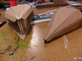
My cardboard is very stylized and very mechanical looking. Everyone liked how it has a very geometric shape and looks incredibly pre-planned. It is a functioning claw so people thought that was very neat. What was so interesting to me is that they expected a lot out of the claw. As soon as I put the claw on my arm to show that it moves, they immediately wanted to see me pick something up with it. It was never intended to pick things up just move but like I said before people saw my piece and expected so much from it. They said that if it looks mechanical then it should be able to do something functional instead of just sitting there doing nothing.
Lecture of Sept 17
The lecture was about the time modernism and post modernism started. It all started when photography was invented. It left artists and painters out of commission to work on portraits and recording events. Artist started to delve into impressionism, cubism and so forth. Then came futurism, constructionism, expressionism. The movements started to invent ways to represent nature instead of capturing it as close as possible.
First Day
On the first day we had to build a tower to hold up a cinderblock made only out of newspaper and masking tape. I made a coral tower and it held up the cinder block very well. It just wasn't tall enough to win. I just wrapped up newspaper and made a square outline with an x in the middle to hold it in place and just kept building it up like that.
Monday, September 13, 2010
Cardboard Project Update
 |
| I have added some ridges and small thorns on it. |
 |
| I have three pieces, the body, and both claws. |
 |
| It is hard to tame cardboard into the shape that you want as you can see the wild beast snarls at me. |
Critique on squares
My team mentioned that both of my square designs were obvious that they were each playful and periodic. However, if the periodic one were to stand by itself then it would be hard to see it as periodic. To them they saw it more as a little on the playful side and had to really contemplate if it was periodic. They wanted the periodic piece to be more central and symmetrical as well as the squares to be the same size.
They saw all of the gestalt principles in my pieces except for proximity.
A pattern they noticed was that on both square designs the positive space seem to start on one corner of an edge. My team mentioned that I had good use of space between the squares because it gave a 3D effect.
Everyone agreed that they want to see the puppy to be texturized so I will do just that because I like the puppy too.
Sunday, September 12, 2010
Exquisite Corpse
The original sentence: The heated house flipped to ok school.
The tweaked sentence ( I thought it was funnier this way): The heated house flipped the ok to the school.
The tweaked sentence ( I thought it was funnier this way): The heated house flipped the ok to the school.
Friday, September 10, 2010
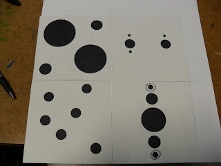
From Dots to Squares
 |
| Drew thumbnails. These are only some of them. |
 |
| I rendered 4 periodically and the 4 playful. |
Thursday, September 9, 2010
Reading:Living With Art
Artist bring four functions: record, visualize the unknown, portray feelings, and stretch one's ability to see.
Creative people possess certain traits: Sensitivity, Flexibility, Originality, Playfulness, Productivity, Fluency, Analytical Skill, Organizational Skill
Anyone can be creative but the class focuses more on visual creativity.
Beauty and ugliness is subjective. A good piece of art evokes some sort of great emotion whether it is a good emotion or a bad one.
Many artist are good at recreating nature but choose not to because they want to draw or paint what they themselves see.
Representational art are images that look very much like the real world or nature.
Abstract Art: Stylized art are basic geometric shapes that represent a real thing.
Nonrepresentational art is art with shapes and color that do not represent anything.
Wednesday, September 8, 2010
Critique on Cardboard
I'm making a crab claw that you can wear on your arm. My group was able to tell that just by looking at it and thought it was really cool. They thought it was interesting that it was very geometric, segmented to resemble more of an arm, and shows mobility. The enjoyed the way I connected my piece together on their ends. Apparently, the group said that the piece looks really stylized and functional with its geometric form giving it a kinetic feel. Has a smoothness all around that brings you in to the piece.
Then they said it was too perfect and needed to be unbalanced and off. That's when I went "whuh?"
Then they said it was too perfect and needed to be unbalanced and off. That's when I went "whuh?"
Wednesday, September 1, 2010
 |
| After the thumbnails I drew up all 40 of them. |
 |
| After that I cut them. |
 |
| As soon as I finished up drawing, shading, and cutting all 40 thumbnail, |
 |
| My team really liked these four. They told me that on the fourth one, one of the groups should be made up of bigger circles so that it wouldn't be so obvious that it was similarity. |
 |
| I finished up the set with the necessary changes. Here is my final product. |
Subscribe to:
Posts (Atom)


