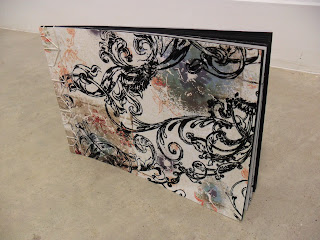
My three books and poster.
Monday, October 25, 2010
Sunday, October 24, 2010
5 Color Sets
1. Mood (calm)
Calm
2. Temperature (Hot)
Hotness
3.Season (Spring)
Fresh Spring Day
4.Gender (Female)
Female Makeup
5. Persons Profession (Civil Engineer)
The Civil Engineer
The swatch titles for each set are what is under the second line of each number. Here is the link to all of them.
http://kuler.adobe.com/#themes/search?term=alortega1215
Monday, October 18, 2010
Mini Poster Critique
These were the final two that were chosen. My group liked the way I used the words and they like the way how it compliments the ink mark. They like how the trail of the ink mark starts strong and then spreads out thinner and thinner because it goes well with my quote. They prefer the top one more because the like how the ink mark looks at the bottom of the page than at the top. They wanted the large font to be a little bit lower of the page because it looks like I am trying to force balance instead of it balancing on its own. Also they thought it would be better if the second part of the quote was a little bit smaller and upside down.
Modular Madness Critique
Everyone liked the geometric shape of my piece. They really liked the hole that I left because it makes them want to peer inside even though the piece is made out of thumbnails and they can easily prick themselves.. They really liked the spider web like threads that is wrapped around the whole piece. What could have been better is that the inside could have more interesting things inside to look at. Also they wanted it to be just a little bit bigger even though Hunter said that would actually hurt it because the spikes are so small that it would loose the feel of it being hazardous.
Sunday, October 17, 2010
Mark Making Contraption
 |
| My contraption is made up of clothes pins, rubber bands, pencils, and hot glue. |
 |
| Close up shot. |
 |
| Reminded of a little construction site so I shot the photo as if it were a tall building. |
 |
| Inside details. |
 |
| I grabbed a light and started playing with the shadows of it. |
Here is my mark making contraption in action.
Modular Madness Process
Thursday, October 14, 2010
Harmony and Balance Reading
Harmony
To create unity, objects that are similar must be put together. However, too much of the same thing would become monotonous.
-One logical way to achieve unity is proximity. Put the same objects close together.
-Repetition can also be used to achieve unity. Repetition can create patterns that flow together.
-Continuation can also be used, however, it is more subtle.
-Continuity is especially important if making a book or magazine. There has to be some variations in the design otherwise it will become boring.
-Thematic unity: an arrangement of similar or related objects.
-The mind sometimes perceives shapes found in a design that aren't really there which is called closure.
-The grid can be used to organize a design.
Balance
There must be balance in a composition.
-Balance can be achieved through symmetry where both sides are like mirror images to each other.
-Asymmetry can also be used for balance because the slight difference makes the composition more interesting.
-Radial balance is symmetry in a spherical space.
- Crystallographic balance occurs when there is equal emphasis in an allover pattern
-Formal balance is more symmetrical
-Informal balance is more asymmetrical
-Inverted symmetry uses symmetry where one half is inverted
-Biaxial symmetry uses two axes of symmetry instead of just one
Thursday, October 7, 2010
Reading from October 1st Lecture
I. Form and Visual Ordering
A. 3 essential components
- subject
- form
- The total arrangement of the composition and to the very act of organizing and composing it.
- content
II. The Principles of Organization
A. Artist begins with the elements and applies to the seven principles of organization
- Principles of organization: harmony, variety, balance, proportion, dominance, movement, and economy
- If successful then the artist has created visual unity
- Harmony
- May be defined as a pleasing relationship between different sections of a composition
- Occurs when elements or independent parts have characteristics in common
- Thought as a factor of cohesion
- Vastly different areas or images will begin to harmonize if they are treated in a similar manner
- certain things are repeated or used more than once in the composition
- does not require exact duplication, just similarity
- Resemblances give a work a degree of harmony
A. Repetition
B. Rhythm
- a continuance, a flow, or a sense of movement that results from repeated beats
- can be affected by the likeness of their character, their direction, their type, their value, their size, and so forth
- creation of rhythm also relies on the repetition of pauses between repeating units.
- Variation and the negative spaces, or intervals, helps create the rhythmic pattern
- Added emphasis on certain beats adds to rhythm
- In visual arts, the “pause” is a negative visual space or less-accented visual unit
- Spacing (visual silence)
C. Pattern
1. a basic pattern is a motif
- the motifs can then come together and create the allover pattern
- motifs don't have to be just patterns and shapes, it can be a theme
- motifs don't have to be exactly the same
D. Closure
- mental process of assembling to create pattern
E. Visual Linking
- closure unifies shapes that share an implied group relationship
- shared space itself becomes the cohesive factor
- shapes that share a common edge
1) Shared Edges
2) Overlapping
1. becomes a shared area
3) Transparency
1. shape or image is seen through another
4) Interpenetration
- When several images not only share the same area but also appear to pass through each other
F. Linking through Extensions (Implied and Subjective Edges/Lines/Shapes)
G. Excessive Use of Harmony
IV. Variety
A. the counterweight to harmony, the other side of organization essential to unity.
B. Contrast
- “opposition or dissimilarity” and occurs wherever elements with opposing characteristics are placed in the same area.
- When artists repeat elements in a way that makes them appear unrelated- such as a few wide lines in a group of narrow ones- the differences, or contrasts, stand out.
- Through the introduction of contrasts that an area, image, or shape is made to become emphasized or more dominant
- Elaboration
- embellishment, or the enhancement of the surface with subtle information, minute details, and pattern.
D. The Dualism of Harmony and Variety
1. One can't exist without the other.
V. Balance
A. has gravitational influence
B. Symmetrical Balance (Formal Balance)
1. visual units are exactly the same on both sides
C. Approximate Symmetrical Balance
1. potential monotony of pure symmetry can be reduced by subtly varying the
nature of the repetition to achieve
D. Radial Balance
1. visual forces are distributed around a central point and often radiate from it.
E. Asymmetrical Balance (Informal/Occult Balance)
VI. Proportion
- deals with the ratio of individual parts to one another or the the whole
- scale is used when proportion is related to size and refers to a standard gauge or “norm” in order to judge the relationship between objects
VII. Dominance
A. to achieve dominance:
- isolation- a separation of one part from the others
- placement- “center stage” is most often used, but another position can be dominant, depending on the surroundings
- direction- a movement that contrasts with others draws focus
- scale or proportion- larger sizes normally dominate, but unusual scale or proportion also attracts attention
- character- a significant difference in general appearance is striking
VIII. Movement
A. lets the eye wander around the artists work and go on a “tour”
IX. Economy
A. Requires to see what works in a piece and what doesn't so that you can remove or add
X. Space: Result of Elements and Principles
XI. Three-Dimensional Form and the Principles of Organization
A.can be tectonic-closed, massive, and simple
B. or atectonic – open, to a large degree
C. Harmony and Varitey
D. Balance
E. Proportion
F. Dominance
G. Movement
- Illusionary
- Kinetic- involves the physical movement of the work itself
E. Economy
Looking for Repetition
(1) Abstract Expressionism
(2) Minimalism
(3) Post Minimalism
Isamu Noguchi, Akari Light Sculptures, 1960s Line is the main element of these sculptures because as a whole they are vertical lines while horizontal lines make them up. It is very close in the monotony side of the spectrum because it is the lines are generally the same width and go in almost in the same direction. The repetition makes me feel calm and the shape the lines create are simple. |
(2) Minimalism
 |
| Another angle of the installation. |
(4) Today (within last 10 years)
 |
| Different angle. |
 |
| Different angle. |
 |
| Closer look at the installation piece. |
Subscribe to:
Comments (Atom)


