Monday, September 13, 2010
Critique on squares
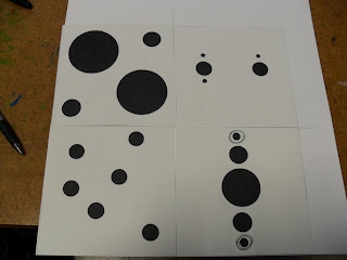
My team mentioned that both of my square designs were obvious that they were each playful and periodic. However, if the periodic one were to stand by itself then it would be hard to see it as periodic. To them they saw it more as a little on the playful side and had to really contemplate if it was periodic. They wanted the periodic piece to be more central and symmetrical as well as the squares to be the same size.
They saw all of the gestalt principles in my pieces except for proximity.
A pattern they noticed was that on both square designs the positive space seem to start on one corner of an edge. My team mentioned that I had good use of space between the squares because it gave a 3D effect.
Everyone agreed that they want to see the puppy to be texturized so I will do just that because I like the puppy too.
Sunday, September 12, 2010
Exquisite Corpse
The original sentence: The heated house flipped to ok school.
The tweaked sentence ( I thought it was funnier this way): The heated house flipped the ok to the school.
The tweaked sentence ( I thought it was funnier this way): The heated house flipped the ok to the school.
Friday, September 10, 2010
From Dots to Squares
 |
| Drew thumbnails. These are only some of them. |
 |
| I rendered 4 periodically and the 4 playful. |
Thursday, September 9, 2010
Reading:Living With Art
Artist bring four functions: record, visualize the unknown, portray feelings, and stretch one's ability to see.
Creative people possess certain traits: Sensitivity, Flexibility, Originality, Playfulness, Productivity, Fluency, Analytical Skill, Organizational Skill
Anyone can be creative but the class focuses more on visual creativity.
Beauty and ugliness is subjective. A good piece of art evokes some sort of great emotion whether it is a good emotion or a bad one.
Many artist are good at recreating nature but choose not to because they want to draw or paint what they themselves see.
Representational art are images that look very much like the real world or nature.
Abstract Art: Stylized art are basic geometric shapes that represent a real thing.
Nonrepresentational art is art with shapes and color that do not represent anything.
Wednesday, September 8, 2010
Critique on Cardboard
I'm making a crab claw that you can wear on your arm. My group was able to tell that just by looking at it and thought it was really cool. They thought it was interesting that it was very geometric, segmented to resemble more of an arm, and shows mobility. The enjoyed the way I connected my piece together on their ends. Apparently, the group said that the piece looks really stylized and functional with its geometric form giving it a kinetic feel. Has a smoothness all around that brings you in to the piece.
Then they said it was too perfect and needed to be unbalanced and off. That's when I went "whuh?"
Then they said it was too perfect and needed to be unbalanced and off. That's when I went "whuh?"
Wednesday, September 1, 2010
 |
| After the thumbnails I drew up all 40 of them. |
 |
| After that I cut them. |
 |
| As soon as I finished up drawing, shading, and cutting all 40 thumbnail, |
 |
| My team really liked these four. They told me that on the fourth one, one of the groups should be made up of bigger circles so that it wouldn't be so obvious that it was similarity. |
 |
| I finished up the set with the necessary changes. Here is my final product. |
Subscribe to:
Posts (Atom)


